Friday, November 30, 2012

Tah-Dah!


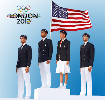
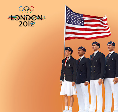
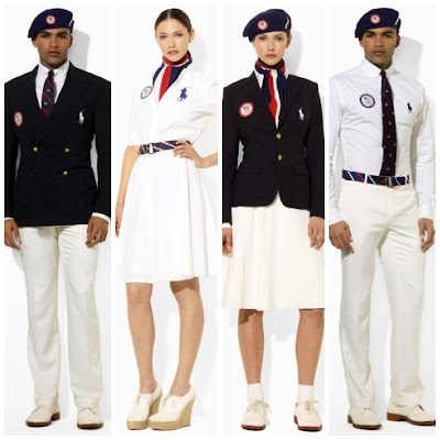
Well, I have to say that I was delighted to have made my presentation. Looking at the Ralph Lauren copy of the Olympic Team Uniform, you truly have to wonder why women weren't offered the same credence that the men were offered. At best, there could have been a 50/50 gender split in the representation. Noting the female model and athlete is being demeaned on many levels is something that breaks my heart! 

The 2012 Summer Olympics in London had MORE female athletes participating than males. They also brought home MORE gold medals too! Certainly there has to be something that should be touted about that… right? Why is it that Heather Mitts (Women’s Soccer) and her fellow female teammates have to look like “young girls” with the men appearing much more prominent, and adult, in their double breasted fashion wear? What’s with the bobby socks?
Anyway, whether it was intended, or not, it is there. Nothing in this photo would remotely indicate that they are members of the Olympic Team, because all you can see the oversized Lauren logo – Big Pony!

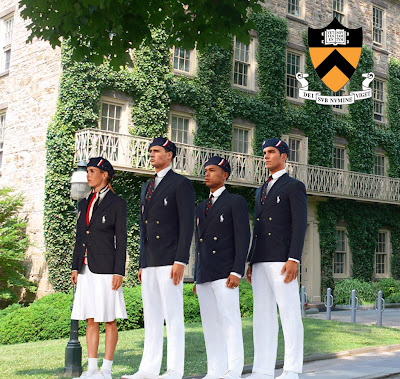
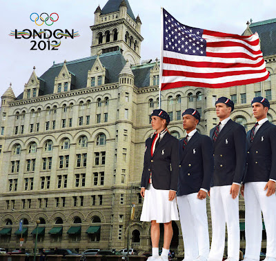
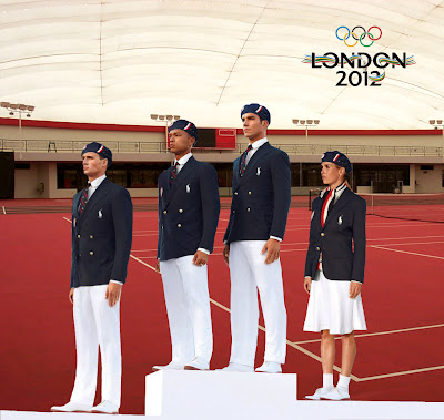
I took the liberty to rearrange the athletes giving them a more equitable line-up, also stating they are Olympic Athletes, but contrasting it with other backgrounds – do you see the argument? The persuasion? The proposition? Let me know what you think…

My opinion - The better arrangement!

Are they athletes or Ivy School (Princeton) scholars?

At least if they were shown as above, you would understand that they are
Olympic athletes in London, donning their Ralph Lauren duds.

Line-up is the same, but at the Tennis venue - do they play tennis?

Switched around - that's better!

Is this the Olympic Yacht Team?

Or, the Yacht club?

Adding orange to the background, with no one holding the flag even looks better to me!

To me, this looks more unified, in terms of team members, and less competitive.
 ----------------------------------------------------------------------------------------------------------------------------------------
This is another view of the uniform - not sure they are models or athletes...

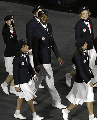
The opening ceremony parade of countries - see how many more women there are?
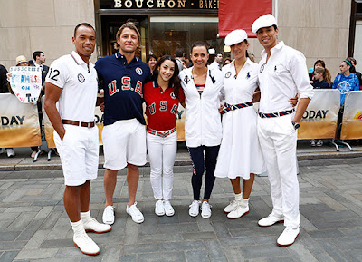
White berets? The American Swag - casual style.


Wednesday, October 24, 2012

Is This American Swag?

So, this is the picture that I have selected to compose my thoughts, feelings and assignment criteria in the Usual Suspects. I'm not exactly sure what it is that compels me to select this particular Ralph Lauren photo, even after all the scrutiny and controversy regarding the Olympic uniform manufacturing [Made In China].

There is still something here that warrants investigating. It's the wardrobe, the athletes/models, the design of the clothes, the colors (uniform and skin), the podium arrangement, the sole female, and, of course, the beret! My hope is that I'll find what it is that I'm seeking from what it is that I'm searching and discovering. Although the parameters of the assignment are completely clear just yet, this will be used as my jumping off point.

Wish me luck!
*Can I just say that I'm delighted not to dwell on something that has true and obvious sexual connotations and some suspect of sexual deviation... Minimalist attributes at their best!

Tuesday, October 23, 2012

Loads of Interest

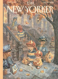
The more I'm searching for material for the Usual Suspects project, the more fascinating this becomes. So look at some of the magazine covers I discovered today...
http://archives.newyorker.com/?i=2001-10-29    
http://www.politico.com/gallery/2012/07/10-controversial-magazine-covers/000314-004102.html
http://www.spd.org/assets_c/2012/10/TNR%202012_02-02-12_Jason%20Holley-thumb-autox550-16549.jpg
http://www.businessinsider.com/businessweek-mormon-cover-2012-7
http://www.vh1.com/celebrity/2011-12-27/taylor-lautner-fake-isnt-joining-these-awesome-coming-out-covers/
http://www.npr.org/blogs/itsallpolitics/2012/03/05/147982460/new-yorker-cover-puts-new-twist-on-old-romney-shaggy-dog-story
http://www.politico.com/blogs/media/2012/05/newsweek-cover-the-first-gay-president-123283.html
http://www.thedailybeast.com/newsweek/2012/07/29/michael-tomasky-a-candidate-with-a-serious-wimp-problem.html
Just remember, I've told you that Jesus Christ is NOT A WHITE MAN!

Thursday, October 18, 2012

What Do You See?

Illustration by: Jason Holley
http://stanmed.stanford.edu/2012summer/article2.html


Illustration by: Steve Babcock

Illustration by: Steve Babcock
I'm stuck! I wanted to find poster-types of advertisement, but I found way too many. I then isolated the ones that actually "spoke" to me by virtue of having some sort of relationship to my life. Shown above are the final picks.

PHOTO/POSTER #1
We just returned from Stanford where my son is considering becoming a student. They have some of the most incredible information available that I began reading an article about Biotechnology medical advancements. When I looked at the flower of the design, along with the hand, I saw many different things. What is it that you see? Perhaps I should have left off the purpose of the ad, but then again, maybe it is something that you should see and know.

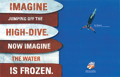
PHOTO/POSTER #2
When I look at the captivating picture of Eric jumping (as in Freestyle Aerials) it brings back a host of memories of when my daughter Chloe was involved in the sport. It actually takes my breath away not knowing if he "landed" his jump or not. For me, it was always a panic situation to watch, and moreso since my daughter sustained a couple of injuries do it. You would have to watch the summer water-ramping at the UOP to understand the message...

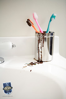
PHOTO/POSTER #3
The same son interested in attending Stanford also plays Rugby - and, yes, he'd like to play with Stanford also. Really this advertising piece about Utah Youth Rugby really disgusts me, enough so that I'm compelled to include it at one of my preferred choices. It is a down-n-dirty sport, but the teeth thing is bothersome! YUCK! Just so you know, it is mandated and required that the players where a mouth guard.

Each sample is different. Each attempts to establish a connection to the words that cannot be read, and each offers a response. For me, they are clean, simple and have a clear message...

Wednesday, October 10, 2012

WHAT IS ENCHANTING COULD NEVER BE MUNDANE

'Tis the gift to be simple, 'tis the gift to be free
'Tis the gift to come down where we ought to be,
And when we find ourselves in the place just right,
'Twill be in the valley of love and delight. 
When working on this assignment, Enchanting the Mundane, this was the message that was clearly resonated while acquiring my photo montage. Putting it together seemed daunting at first, but once I had the music I was going to use, it just became so much easier. I had the audio piece first, but then when I found the video, I began to navigate how I would  incorporate it for this project. 
All-n-all, I think it worked. I took those things that typically appear mundane to give them a sense of being and belonging - they now appeared to have a place and a life...

Watch it again, if you wish, and offer your thoughts to what you feel I could enhance...

Sunday, September 30, 2012

Visual Rhetoric and Argument [Sketches by M.C. Escher]


Escher - Drawing Hands, 1948
Let’s explore the work of M.C. Escher (Dutch Artist, 1898-1972). When you look at this drawing (above) “Drawing Hands”, from 1948, you see two hands, but what are they doing? Explore it carefully. You see they are more-or-less drawing, but what? They happen to be drawing each hand ‘into existence’, which makes the hand images rise above the flattened cuff, and off the page to create the paradox. This was Escher’s trademark, of sorts, and it creates ambiguity of the mind, thus creating a visual argument. I guess it could have text, but I think that would merely complicate the design, so, let’s argue about it.

I have rather an obsession with tessellations; probably why I like Escher’s work so much. They occur about everywhere from flooring to nature, architecture, and more. They are regular and obtuse, polygons and circles, but have some symmetry. Look at the piece below and tell me what you see. Heads, alright, but how many, and what gender? Does it matter? What are they heads of? Who? You can see so much, but you have to wonder what it’s saying to you. The negative space reveals something embedded below, but how is that significant?  Man, I love this stuff!
Escher - Eight Heads, 1922
Look at the next one. Look closely to see what the water is doing. What are the people in this sketch doing? Where are they? What is their meaning? The artist had the intention of putting them in there for you (or himself) but to create illusion, a kind of billboard of conveyance. What does it say?
Escher - Waterfall, 1961

WHAT SHARON THINKS IS… I believe these sketches all to be excellent examples of what Visual Rhetoric is about. It is the underlying message in what is presented, in whatever form it is given.

Hmmm, Visual Rhetoric… What the hell is it?


Any time I see the word “rhetoric” I cringe.  It has such a sinister sound; one you just have to know that it equates awful.  Just say the word:  R – H – E – T – O – R – I – C ”. Yikes!  I guess most any word that ends with an “ick” doesn’t sound so great. “Visual”. Yes, that’s a word I can relate to! I know this from the lens of a camera, the lens of my eye, and the little lenses happening all around me. 

When you put the two together, I’m not sure that I believed that you could get something related to academia.

  •       Photon Language?
  •       Receptor Words?
  •       Pretty Prose?
  •       Picture Discourse?
  •       Optical Speech?
  •       Artfully Communicating?
  •       Graphically Speaking?

Using some dissection, as you see above, it conveys something that could mean a lot of different things to an array of colorful people, merely interpreting the individual definitions. The relationship of these two words brings immediately to mind the works of Alison Bechdel; Fun Home, where she’s giving her account of growing up in comic form, not to mention her current life happenings.  I guess that would be visual rhetoric. Videos, ads, commercials, brochures, and a host of other media, campaigning and advertising could also offer highly persuasive content, and does.

The combination of linguistic content with added visual components allows consumers and the general public the susceptibility of this powerful influence; visual rhetoric, and we are surrounded by it each day. From Sirc, it would be compositional media which allows both textual pleasure from collections of text and imagery (Box Logic, 116).

The world is full of arguments! Why would visual rhetoric be any different? Of course there will be differences in what is interpreted from a perceived image, not to mention what text will do to us. No two people are going to see exactly what you are visualizing! They can’t!  This association, then, would be known as the argument. It is the arrangement of defined elements on a page, font selection, and images which all create and define “argument”.

WHAT SHARON THINKS ISVisual Rhetoric is a sketchbook narrative of all that is seen and unseen and a more modernist view of a lens, any lens, which unfurls a story.

Thursday, September 13, 2012

So, What is Studium and Punctum?

In order to help me process this new knowledge of Barthes studium and punctum, I need to read a little more to help direct me in a forward direction. I now have the book Camera Lucida so that I can put into perspective what it is that we are actually looking at.


About Studium (Barthes):
“What I feel about these photographs derives from an average affect, almost from a certain training. I did not know a French word which might account for this kind of human interest, but I believe this word exists in Latin: it is studium, which does not mean, at least not immediately, “study”, but application to a thing, taste for someone, a kind of general, enthusiastic commitment, of course, but without special acuity.” (26)

“It is by studium that I am interested in so many photographs, whether I receive them as political testimony or enjoy them as good historical scenes: for it is culturally (this connotation is present in studium) that I participate in the figures, the faces, the gestures, the setting, the actions.” (26)

It is cleaver that he derived a word to encompass what it is that he sees. I would have never picked this word, but I guess that it works. So studium is the actual where, when and the what of the actual photo. Now I get it!

About Punctum (Barthes):
“The second element will break (or punctuate) the studium. This time is it not I who seek it out (as I invest the field of the studium with my sovereign consciousness),  it is this element which rises from the scene, shoots out f it like an arrow, and pierces me. A Latin word exist to designate this wound, this prick, this mark made by a pointed instrument: the word suits me all the better in that is also refers to the notion of punctuation, and because the photographs I am speaking of are in effect punctuated, sometimes even speckled with these sensitive points; precisely these marks are so many points.” (26-27)

“This second element which will disturb the studium I shall therefore call punctum; for punctum is also: sting, speck, cut, little hole – and also the cast of the dice. A photograph’s punctum is that accident which pricks me (but also bruises me, is poignant to me). (26-27)

He continues: “Many photographs are, alas, inert under my gaze. But even among those which have some existence in my eyes, most provoke only a general and, so to speak, polite interest: they have no punctum in them: they please or displease me without pricking me: they are invested with no more than studium.The studium is that very wide field of unconcerned desire, of various interest, of inconsequential taste: I like / I don’t like“. (27)

This opens the door to describe about anything in the photo and would be related to what you are immediately affected by when you look at the image, but it should be noted that just because an image contains a studium doesn’t mean that it must contain a punctum… He seems clear about that!

So, let's dissect the photo below:

The studium here would have to be easy... A child investigates the new baby, but is it a boy or a girl?
The punctum is the mother's lap that they both appear on, her hand in the foreground, the yellow bracelet on the toddlers wrist, the traditional institutional chair in the background. These are the other "clues" of the photo offering me the punctum