 |
Illustration by: Jason Holley
http://stanmed.stanford.edu/2012summer/article2.html |
|
|
|
|
|
 |
| Illustration by: Steve Babcock |
|
|
 |
| Illustration by: Steve Babcock |
I'm stuck! I wanted to find poster-types of advertisement, but I found way too many. I then isolated the ones that actually "spoke" to me by virtue of having some sort of relationship to my life. Shown above are the final picks.
PHOTO/POSTER #1
We just returned from Stanford where my son is considering becoming a student. They have some of the most incredible information available that I began reading an article about Biotechnology medical advancements. When I looked at the flower of the design, along with the hand, I saw many different things. What is it that you see? Perhaps I should have left off the purpose of the ad, but then again, maybe it is something that you should see and know.
PHOTO/POSTER #2
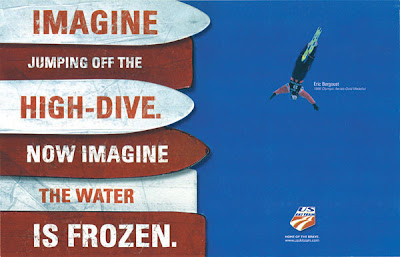
When I look at the captivating picture of Eric jumping (as in Freestyle Aerials) it brings back a host of memories of when my daughter Chloe was involved in the sport. It actually takes my breath away not knowing if he "landed" his jump or not. For me, it was always a panic situation to watch, and moreso since my daughter sustained a couple of injuries do it. You would have to watch the summer water-ramping at the UOP to understand the message...
PHOTO/POSTER #3
The same son interested in attending Stanford also plays Rugby - and, yes, he'd like to play with Stanford also. Really this advertising piece about Utah Youth Rugby really disgusts me, enough so that I'm compelled to include it at one of my preferred choices. It is a down-n-dirty sport, but the teeth thing is bothersome! YUCK! Just so you know, it is mandated and required that the players where a mouth guard.
Each sample is different. Each attempts to establish a connection to the words that cannot be read, and each offers a response. For me, they are clean, simple and have a clear message...


